
Scaling Credit Card self-service
How Strategy helped increase digital engagement to 67.5%
UX STRATEGY . RESEARCH . TESTING .
VISUAL DESIGN

BACKGROUND AND CONTEXT
When shipping Outpaced Consistency
At the time, our credit card product was rapidly expanding, with seven new features being designed and developed by different product teams, all aiming to launch simultaneously. While the pace was exciting, each team operated in isolation with its own roadmap, designers, and design patterns.
I began noticing early signs of UX fragmentation: similar tasks had different flows, components weren’t reused, and some features introduced conflicting interaction patterns. While each team addressed its issues, the collective experience risked feeling inconsistent and overwhelming to users.
A fragmented experience would not only confuse users but could also reduce adoption, increase support costs, and undermine long-term customer loyalty.
SUMMARY
Executive Summary
My Role and Timeline
As a Senior UX designer, I led the end-to-end UX strategy, defining the problem space, aligning stakeholders across product, design, and engineering, facilitating working sessions, and delivering a cross-functional framework that guided feature development.
The Challenge
Each team operated in isolation, developing siloed solutions with inconsistent patterns. Lacking a unified approach, this would have led to confusing and disjointed customer experiences, along with increased operational and support costs.
Impact and Outcomes
- Delivered a unified UX strategy framework along with an optimal feature release sequence that was adopted across all seven teams.
- Prevented UX fragmentation prior to launching features. Achieved a
- 20% reduction in standard self-serve call drivers. Noted an
- 8% improvement in NPS for the credit card experience.

PROBLEM SPACE
Good features, bad fit
The core problem wasn’t a broken screen or a clunky flow; it was a misalignment at the system level. Each of the seven teams was building well-intentioned credit card features in isolation.
There were no shared principles, no clear ownership of the holistic design experience, and limited visibility into how each flow impacted the larger user journey.
Without intervention, launching these features as they are would have resulted in a fragmented and confusing product experience. Here’s how I broke down the problem:
Inconsistent interaction patterns
Daily actions such as reviewing transaction details or managing settings were addressed inconsistently across features.
Fragmented entry points
Users would need to search through various menus to find new capabilities, as there is no unified navigation.
Competing mental models
The same user could encounter multiple approaches to similar problems within the same experience.
Duplicated or contradictory functionality
Similar features presented slightly differently, adding friction and eroding trust.
This wasn’t just a UX concern. The business impact was real:
- Increased volume of support calls (due to user confusion)
- Lower adoption rates of new features.
- Decreased satisfaction with the overall credit card experience.
It was clear: this wasn’t a UI fix. What we needed was a strategic framework, something to align teams around a consistent, user-centric approach without slowing them down.
STRATEGIC GOALS
Setting the strategy
I defined four goals to guide this initiative.
- Create a shared vision for the in-flight credit card features.
- Define reusable UX patterns and interaction principles to reduce inconsistency.
- Enable teams to work quickly without duplicating efforts or confusing users.
- Enhance the overall user experience by minimizing friction, repetition, and drop-off rates.
This effort aimed to empower teams to build independently without working in isolation, while ensuring the product remained a unified experience.


STAKEHOLDER ENGAGEMENT
Alignment behind one experience
It was necessary to identify the key stakeholders from the seven project teams working on the features. I framed this as a collaborative design strategy effort that would help each team ship smarter, not slower.
What I did
- One-on-one meetings with every design and product lead help clarify timelines, goals, roadblocks, and existing UX assumptions.
- Synthesized overlaps and conflicts from those conversations into a shared board.
- Facilitated alignment workshops to co-create the core principles of the framework.
- Positioned the framework as a tool, not a governance model, something that makes each team’s job easier.


AUDITS AND WORKING SESSIONS
Mapping and facilitating the Alignment
I conducted a series of working sessions, including a UX audit across all seven in-flight features, gathering flows, documentation, and prototypes to analyze where things were diverging. The fragmentation was more severe than expected.
Areas we explored
“What should the credit card experience feel like from a user’s perspective?”
“Where do we risk confusing or overwhelming users right now?”
“What do we all agree a smooth, cohesive experience needs?”
Key Findings
- Duplicate flows for similar tasks.
- Conflicting interaction patterns across features (some utilise models, others full-page confirmations).
- Different language and terminology for similar user actions.
- No unified visual or structural rhythm between flows, resulting in significant context-switching for users.
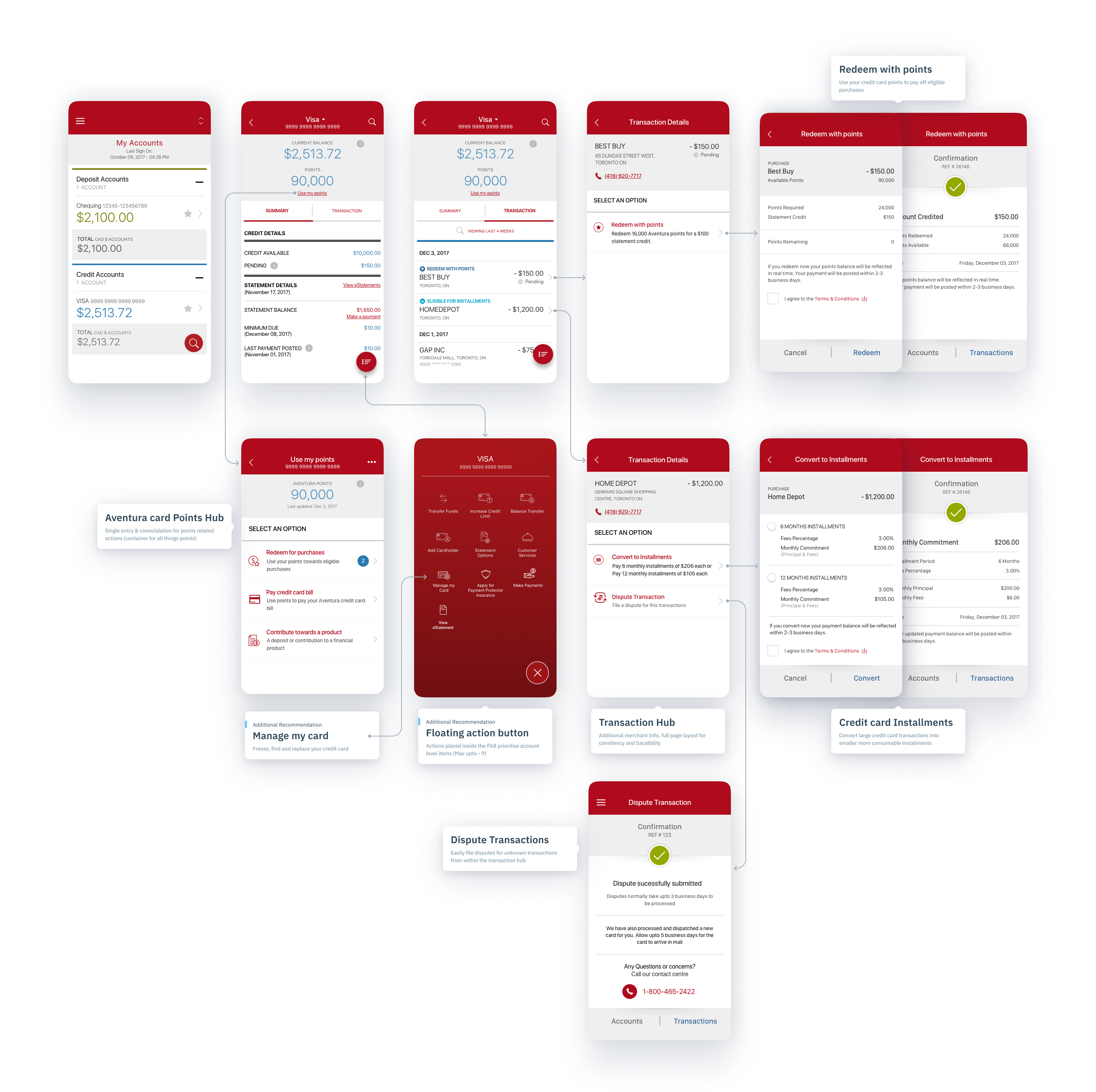
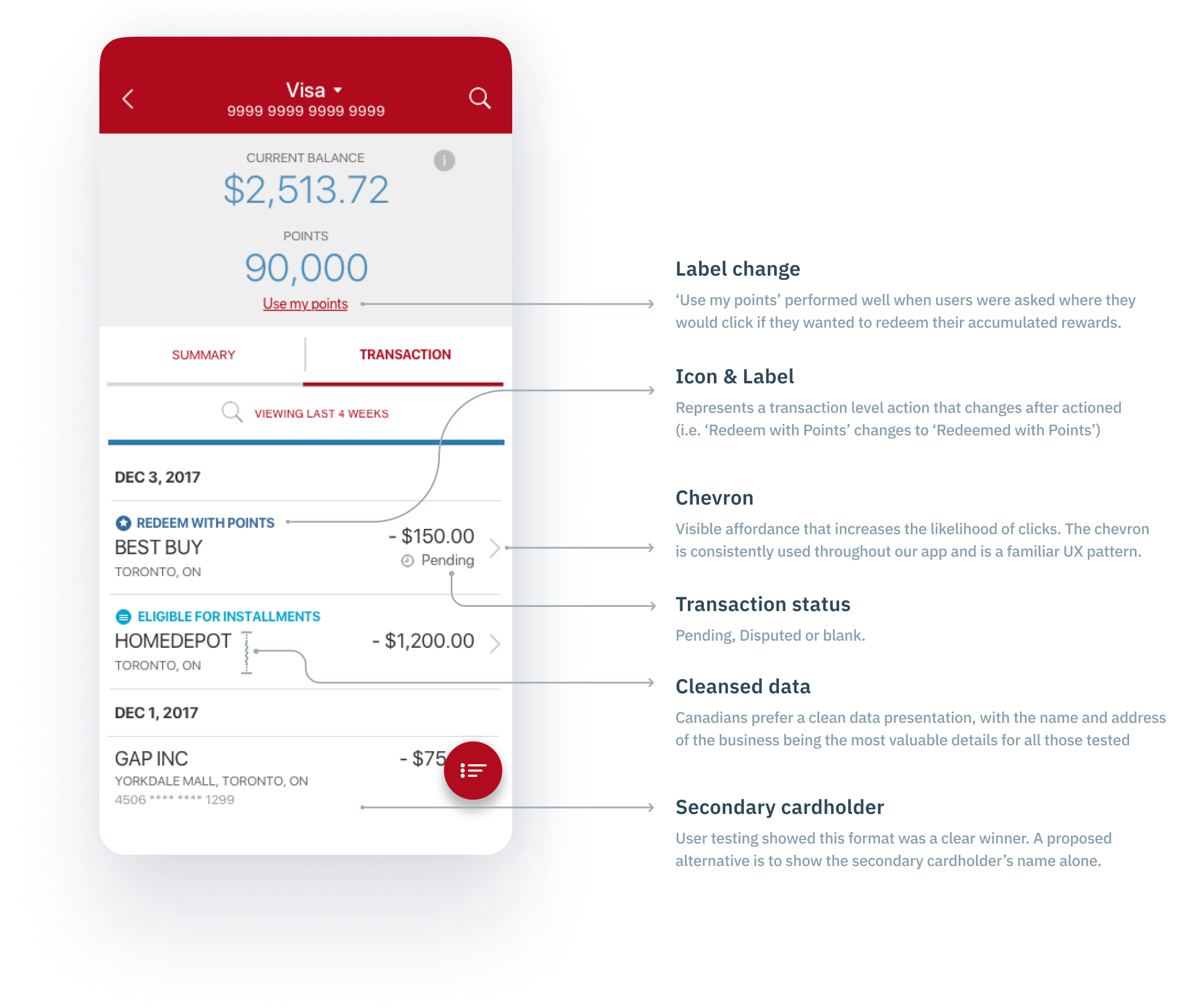
Patterns were deconstructed into logical steps and applied consistently across all features. This resulted in a cohesive design language among the features, which also aligned with the overall structure of the section on credit cards.

TESTING
What Users Showed Us
To evaluate how discoverable and intuitive the credit card experience felt across the new features, we conducted a usability study using combined interactive prototypes. We assessed realistic tasks such as reviewing transactions and managing your card throughout the entire credit card experience.
Insights that informed the framework
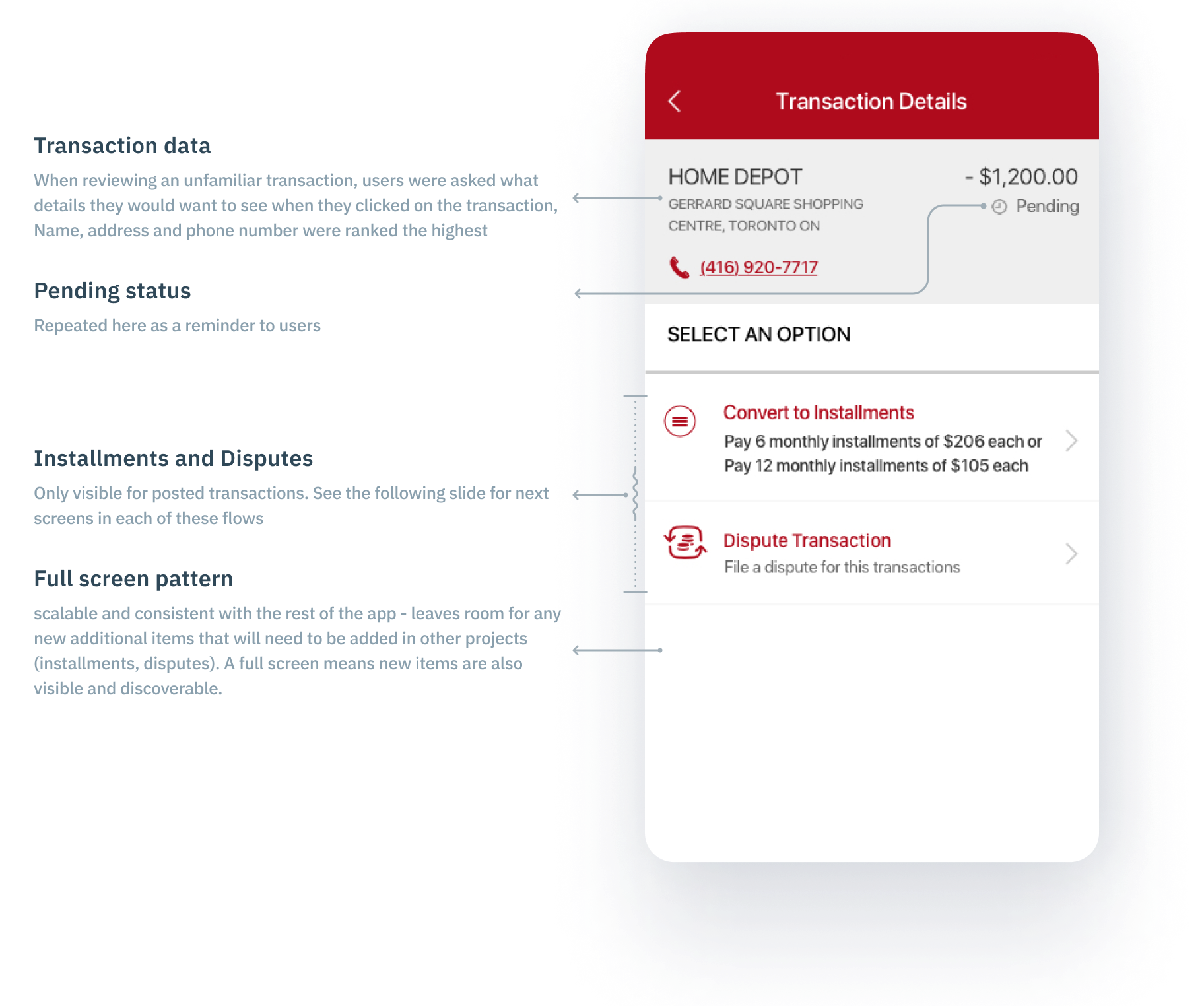
Unclear transaction metadata
Users were confused by irrelevant confirmation numbers displayed in transaction details. This created cognitive noise and raised trust concerns.
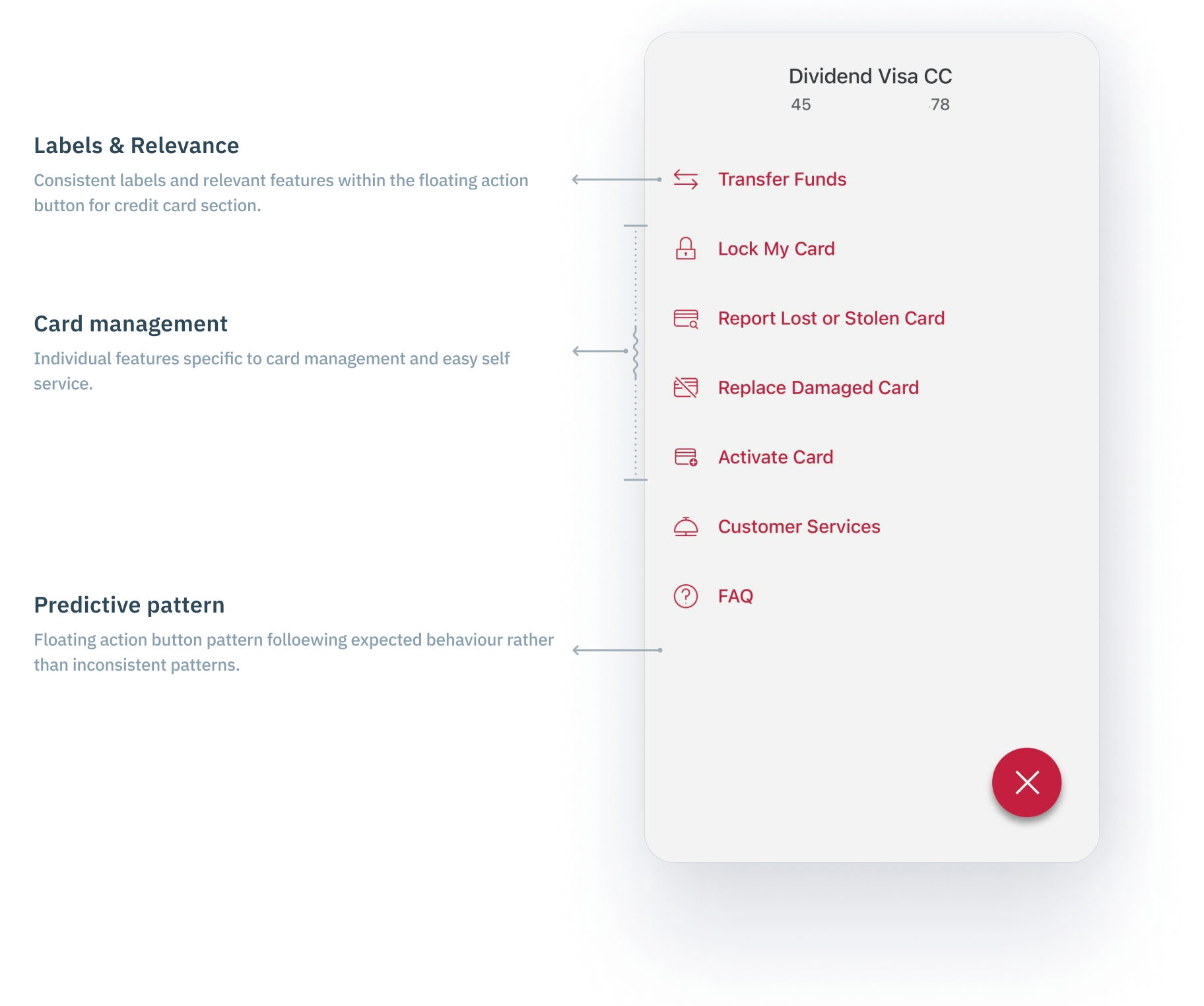
Hidden frequent actions
Tasks that users frequently performed, such as activating a card or managing limits, were hidden beneath menus.
Lack of guiding signals
Without visual cues or progressive disclosure, many features felt “invisible” unless users already knew to look for them.
Ambiguous labeling
Some features had internal names or jargon that didn’t match user expectations.
These findings were essential in developing the principles and reusable patterns of the UX framework, ensuring that alignment included not just visual consistency but also enhanced clarity, navigation, and trust.


A SHARED STRATEGY
What the Framework Enabled
The framework wasn’t a rigid checklist, flow, or screens; it was a set of principles based on experience, reusable interaction patterns, and lightweight decision-support tools designed to create a scalable system that helps teams stay aligned and develop better experiences.
The framework
- Four high-level UX principles for experience goals: Minimize friction, ensure consistent structure, simplify discovery, and prioritize clarity over cleverness.
- Reusable patterns: Core building blocks for similar flows, including feature entry, confirmation flows, modals, confirmations, and feature introductions.
- Design guardrails: guidelines on when to diverge and how to align again.
- A shared language, artifacts, and decision model that teams utilize in critiques, specifications, and planning sessions.
IMPACT
Measurable and cultural
Teams reused patterns and aligned naturally, reducing design debt. There were fewer UX issues flagged during QA and UAT, and PMs and designers adopted a shared perspective on the entire experience.
Credit card call volumes declined from 340,022 to 268,620 annually due to fewer common irritants for those seven features, and the 30-day Digital customer engagement achieved a record high of 67.52% since its inception.
According to IPSOS, CIBC Digital was awarded the top mobile bank in Canada for the fifth consecutive year, as well as the top mobile Net Promoter Score of +60.2, exceeding the target of +55.

LEARNINGS AND REFELCTIONS
What could be done differently?
While the initiative was successful, it also highlighted opportunities for improvement on scaling the design strategy.
- I’d involve Legal & Compliance earlier to anticipate guardrails earlier in the flow.
- I would’ve set up a clearer measurement model to track the adoption of the framework over time.
- I’d formalize a ritual or cadence for reviewing and updating the framework with teams as their needs evolve.
- And I’d invest in better onboarding materials for new team members so they could quickly ramp up to the shared vision.
© Yash Bhatt. Designed with ♥ & powered by curiosity